Viome develops wellness tests and personalized nutrition recommendations, supplements, and other health products based on saliva, stool, and blood samples. I was design lead for the app redesign and collaborated with one other junior UX designer and the marketing team.
Project Impact
Research
Our redesign kickoff was informed by a recent diary study done with 12 customers, plus survey data from 1795 customers, plus our quantitative metrics on existing app usage.
“Viome provided me with a lot of information, but I felt like that information was overwhelming when it comes to figuring out what to do with it. So, I've done nothing.”
Show me the data... or not. Customers’ need for data, scores, links to studies, etc. varied by individual. Some preferred to just trust us to “tell them what to do”.
Many need structure. Our more conscientious customers would create spreadsheets of their food recommendations, along with elaborate tracking of scores between retests. At the same time, many other customers found it very difficult to change their eating patterns or remember to take their supplements.
Chronic symptoms. Unlike our most vocal but small cohort of cutomers suffering chronic health symptoms, our main base was interested in longer term health optimization and longevity. Thus they lacked the feedback loop afforded to those who might clear up a skin condition or relieve a digestion issue.
Many of our customers lacked a habit change mechanism. We could use the cue of food lookup to reinforce the behavior of tracking superfood points.

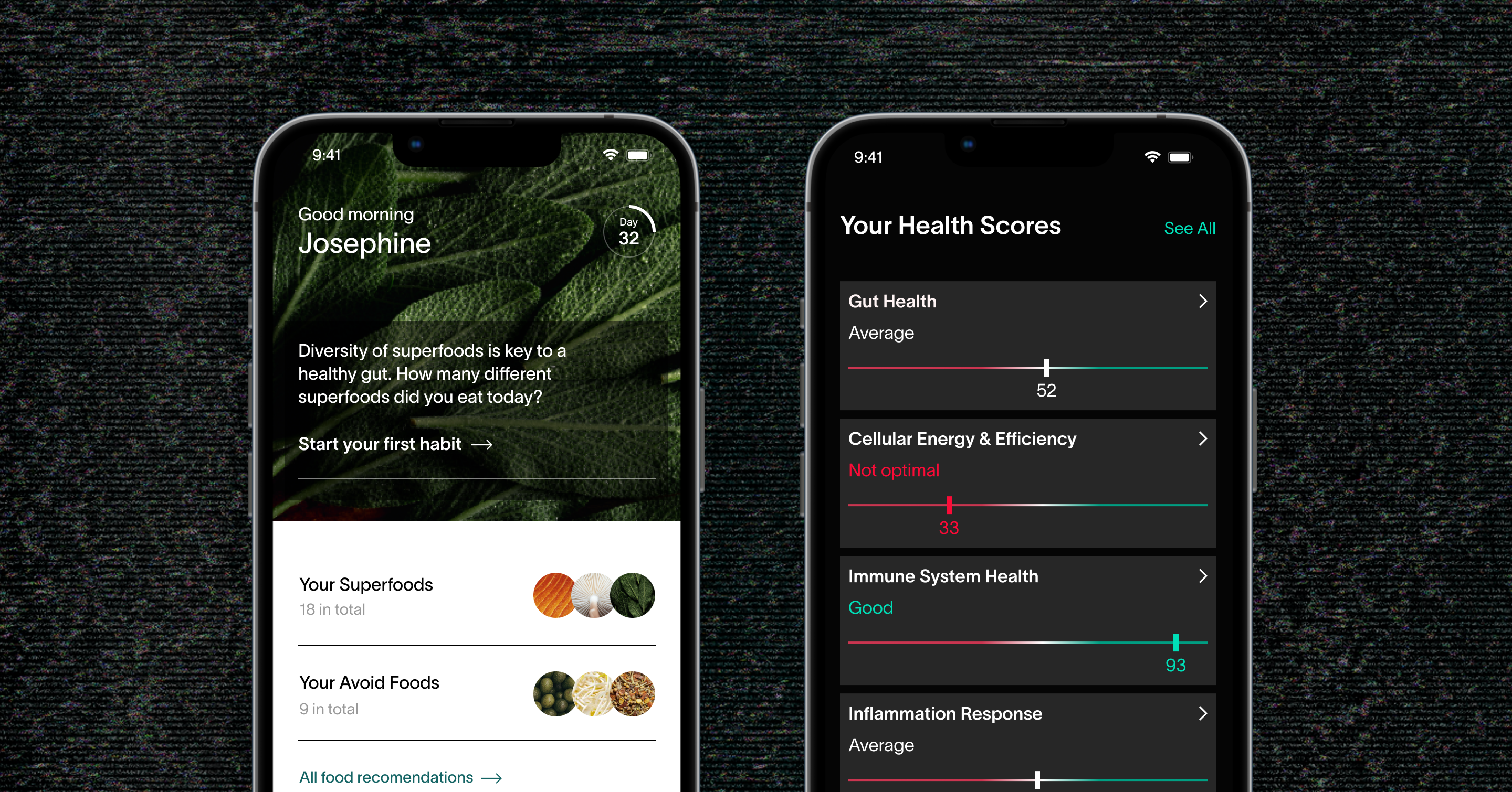
Instant food lookup. Because they were the most common tap events in the application metrics, I wanted superfoods and avoid foods to be immediately available from the app home screen for grocery shopping, meal planning, or dining out.
Tying food to score improvement. Working with the clinical nutrition team, I designed a scalable framework to dynamically build food narratives based on individual test scores. This method of progressive disclosure served the customers who just wanted short directives “tell me what to do” and those who wanted more detailed explanation, and links to peer reviewed studies for further reading if desired.
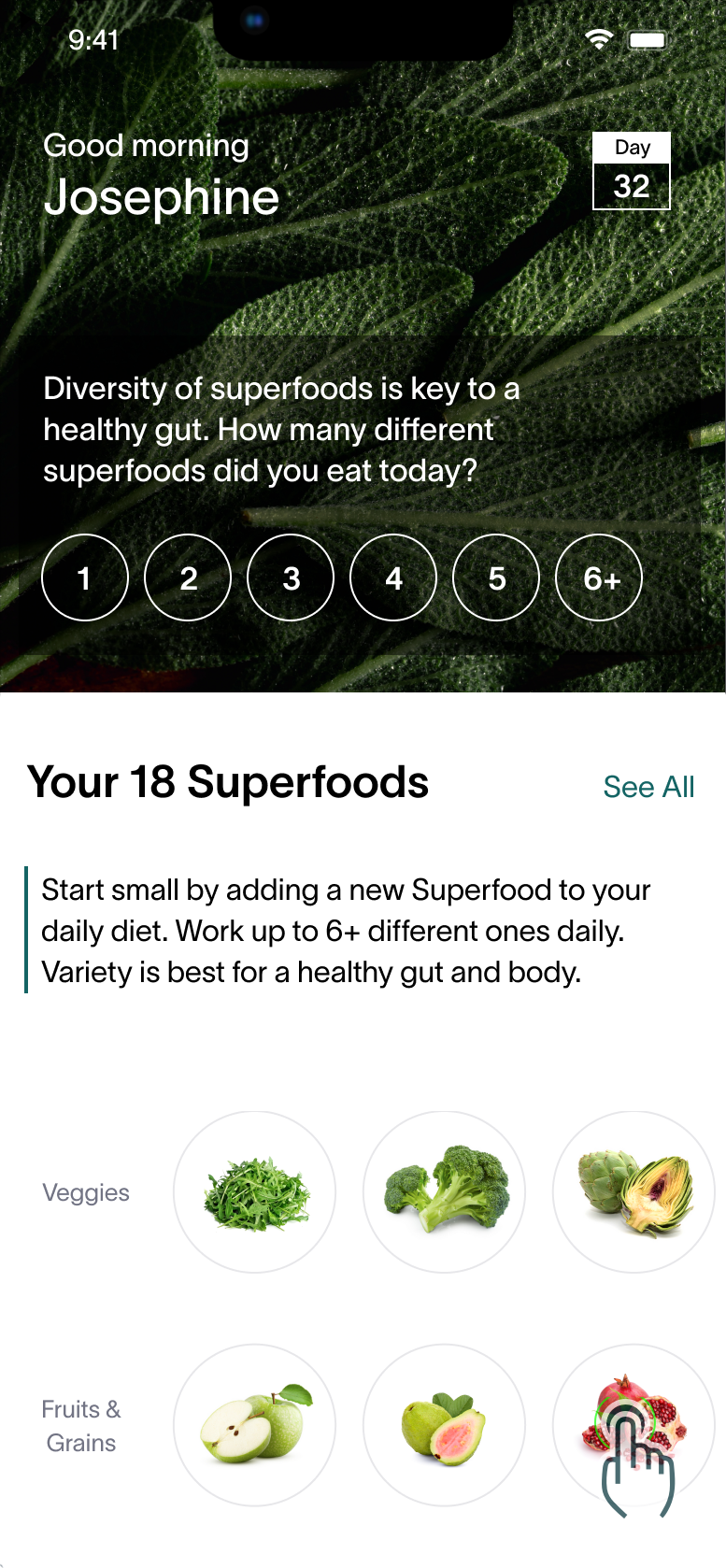
A simple way to track daily superfood intake was a key feature of the redesign. Members could now earn points by eating superfoods.

Lines instead of rings
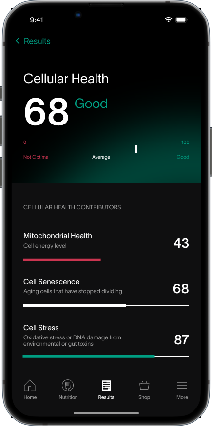
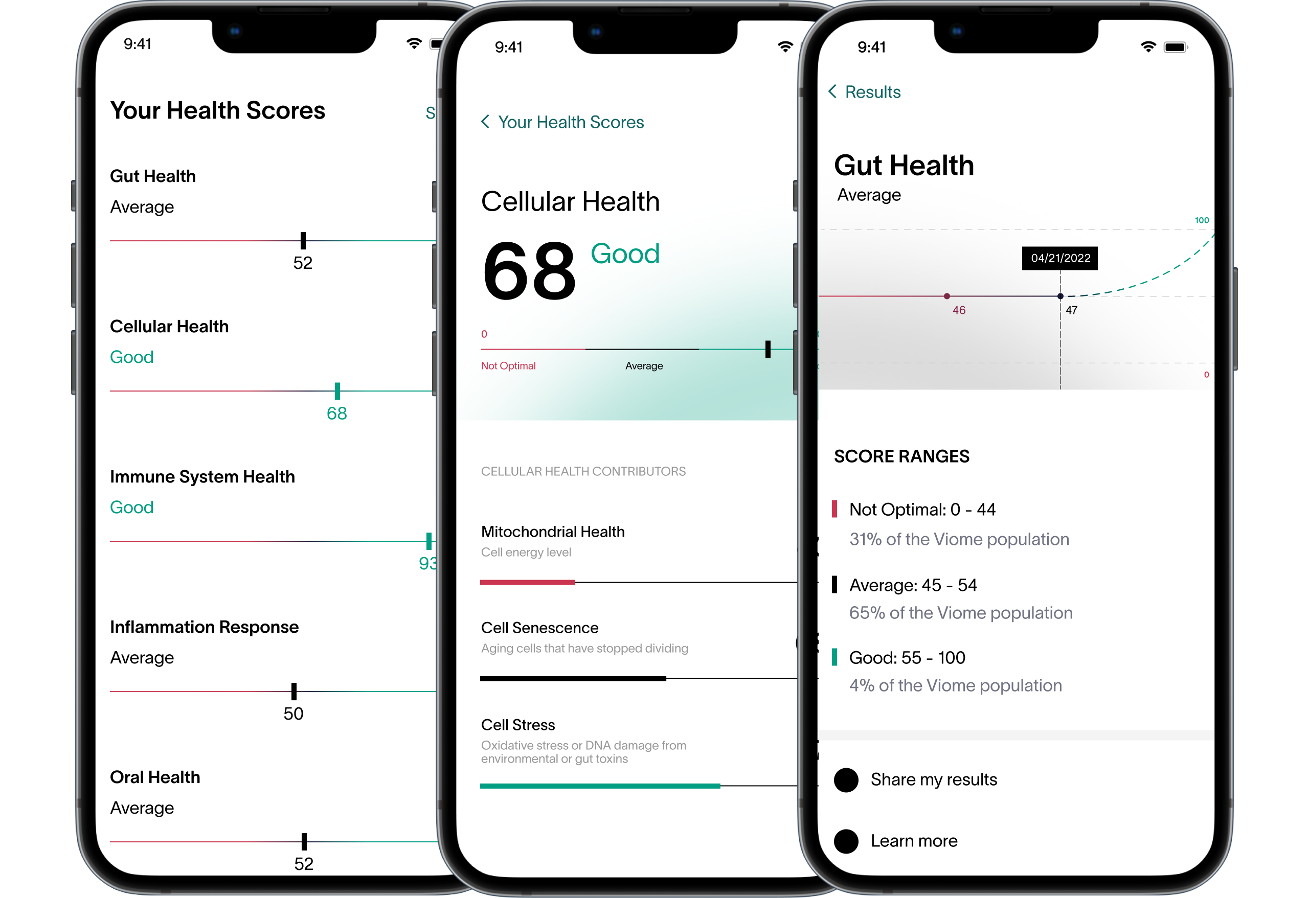
The previous version of the app had rings for all major scores. As many of the scores were not suited to being completed to 100%, I found that linear bars were much better suited to the metrics.
Clear Hierarchy
Using color and visual hierarchy, I made the score pages easy to scan. I also added explanatory text to help explain complex scientific terms.
Support Data Enthusiasts
The redesigned scores and dashboards were useful for customers who preferred to dive deep into underlying data.
“During the pandemic, I read over 1000 articles relating to longevity. We should be able to live to 130 – the key is more data so we can understand more and do more.”
Outcome Measures